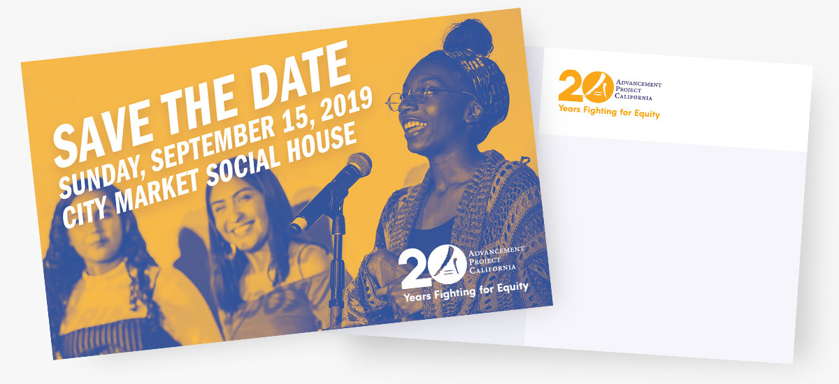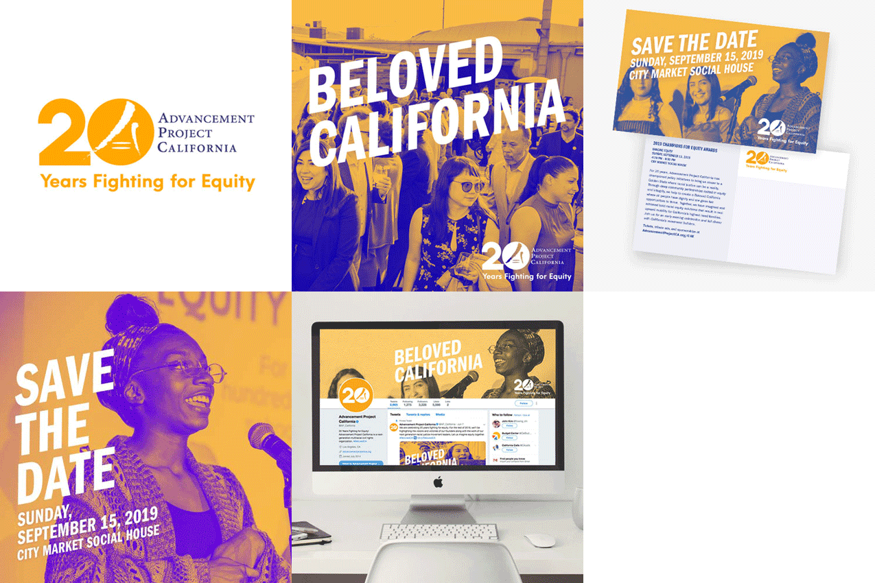
Advancement Project California, a racial justice nonprofit, wanted to mark 20 years of work with an identity that felt like California itself, warm, bold, and rooted in the communities they fight for. I worked with an international brand designer in my network and the client’s own brand strategist to build a mark and a full year of campaign templates the team could run with well beyond the anniversary itself.
Advancement Project California:
A 20th Anniversary Mark
Colors and Type

The Golden State
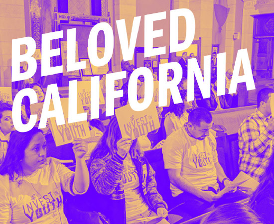
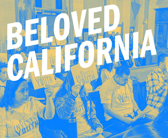
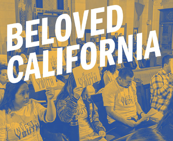
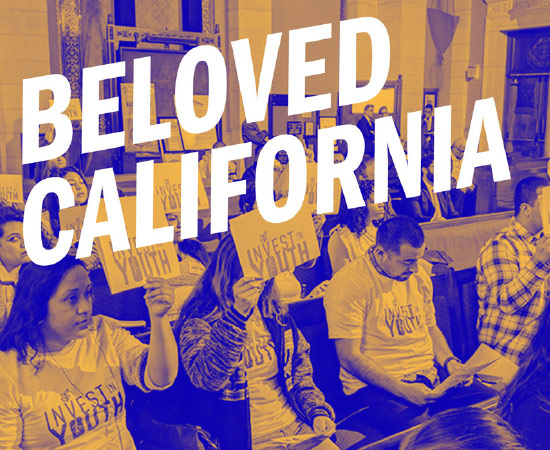
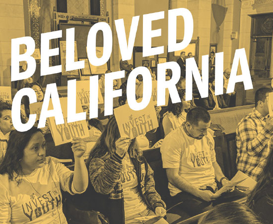
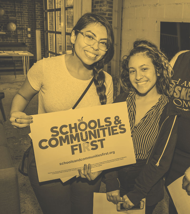
Joyful and breezy, that’s how the Golden State feels. Oranges and yellows display the vivid essence of California, while the blue, purple, and violets of sunsets enhance it. Combining these two color groups created a beautiful color palette.
To be Frank
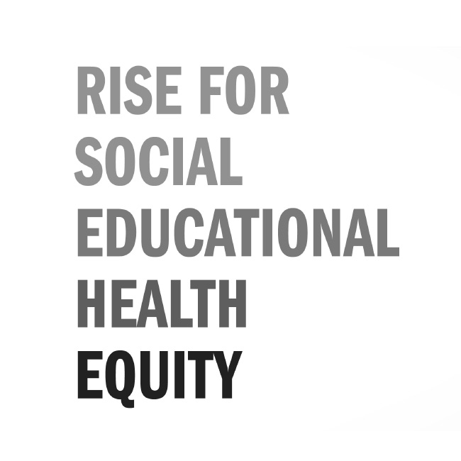
Bold, honest, and reminiscent of social empowerment movements, Franklin Gothic was the chosen typeface for its boldness. An uppercase compressed version was used for headers.
Fun with Web
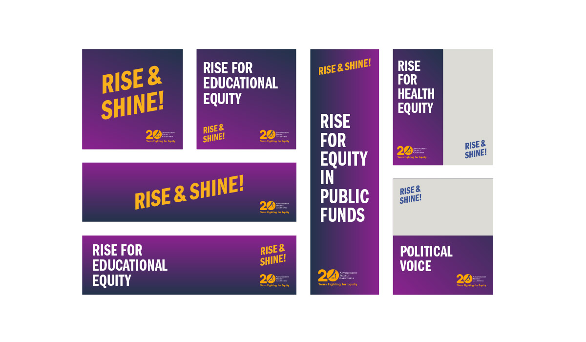
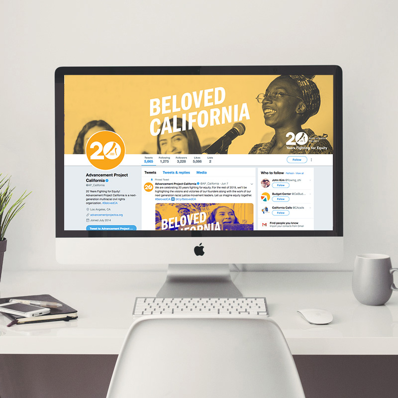
We created general web, social, and email templates for the client to use as needed in the future.
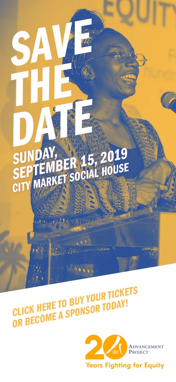
Postcard
This postcard served as a Save the Date reminder for an upcoming event.