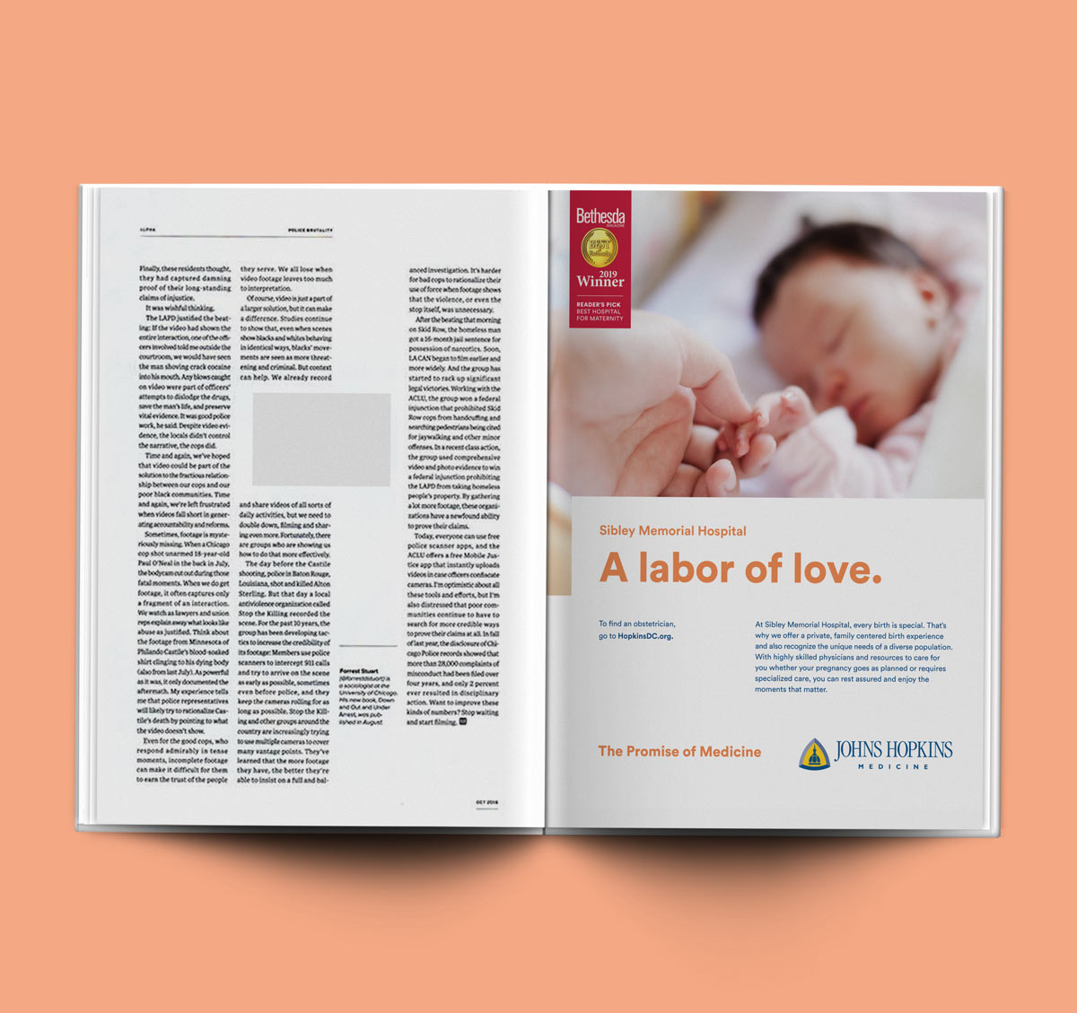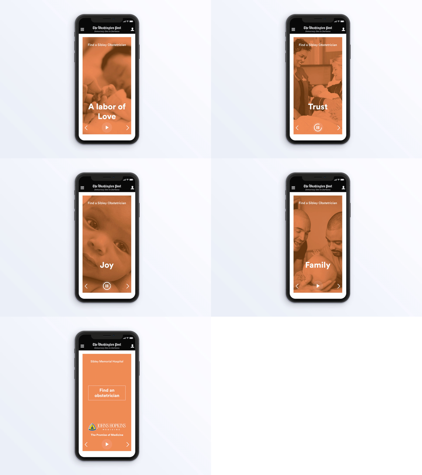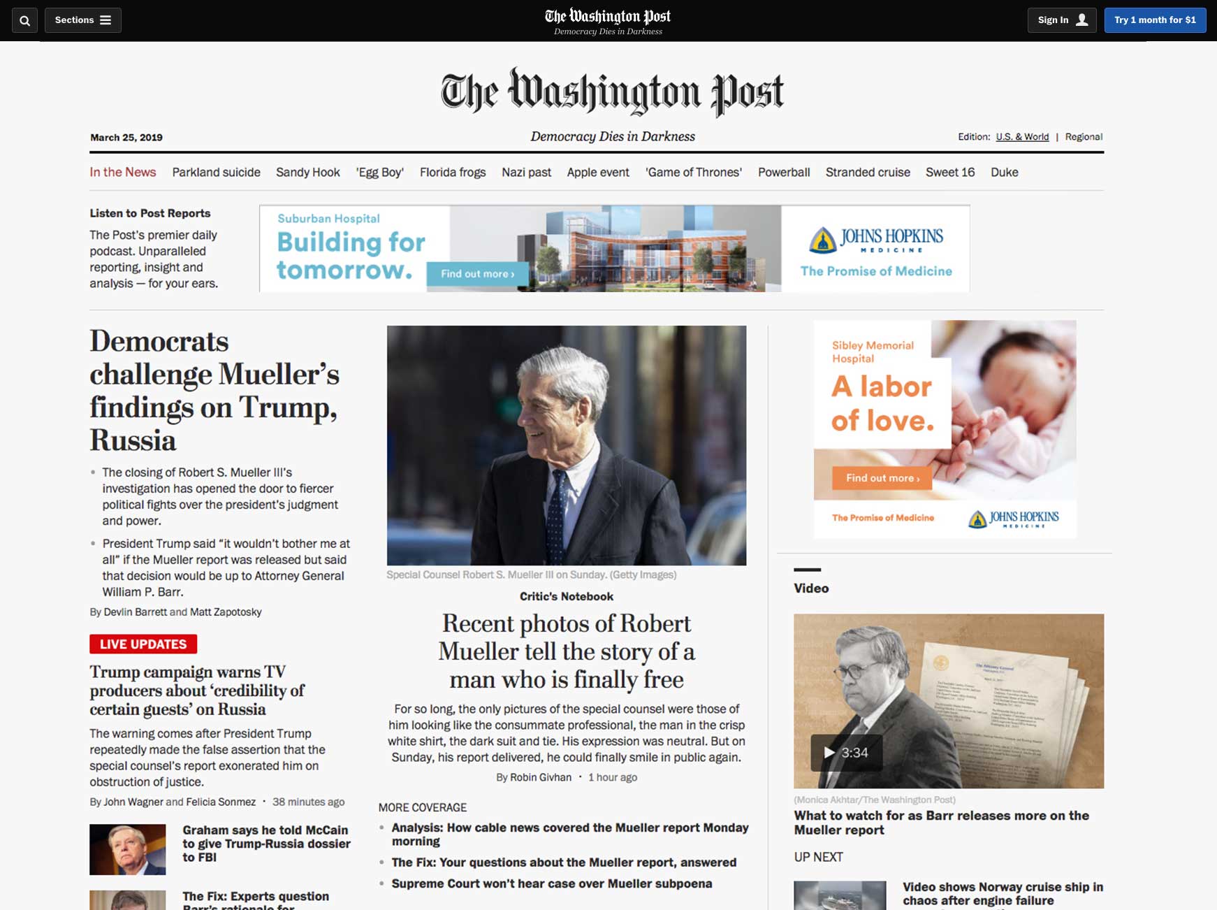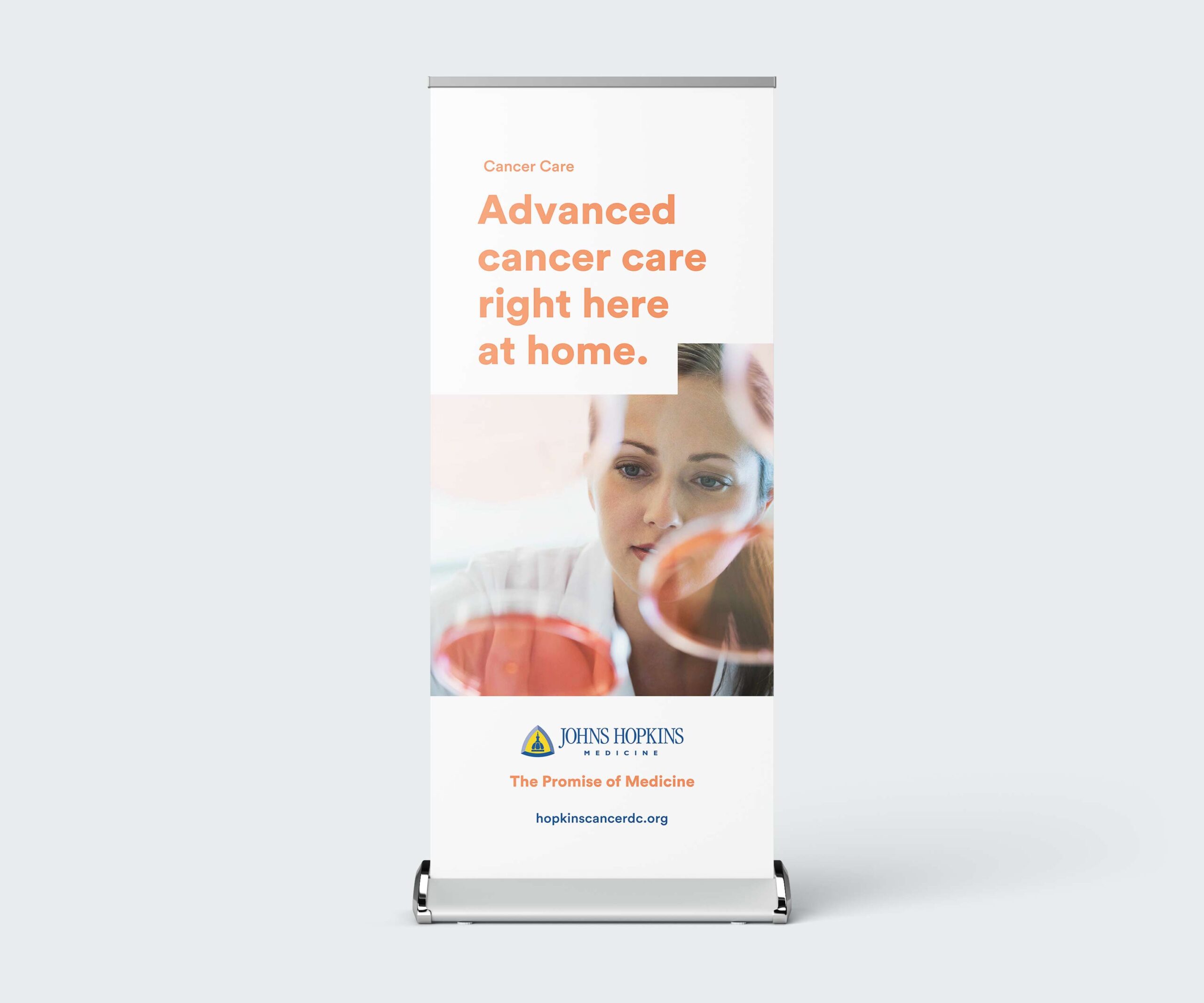
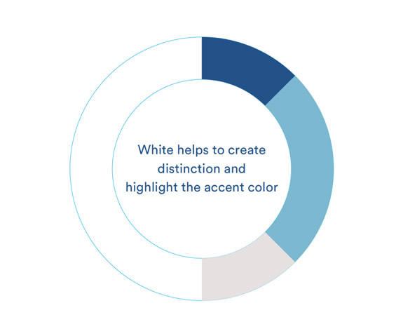
Johns Hopkins Medicine’s brand had gone stale, dated fonts that looked clunky on screens, while DMV-market competitors ran nearly identical color palettes and typefaces and outspent Hopkins as much as 11 to 1 in some cases. Outspending them wasn’t an option, so I focused the team on differentiation instead: strip the layouts down, go white and airy, and use color only as an accent.
I oversaw the process from the creative side, working closely with a brand designer and a brand strategist. With the designer, that mostly meant giving him room to run and stress-testing layouts against how they’d perform in market. With the strategist, it meant making sure the brand’s voice would actually resonate in that market. From there, I helped sell the direction through Hopkins’ many layers of stakeholders. The refresh still anchors Hopkins’ presence across the DMV today, including their expansion into Northern Virginia, while the broader organization weighs rolling it out further.
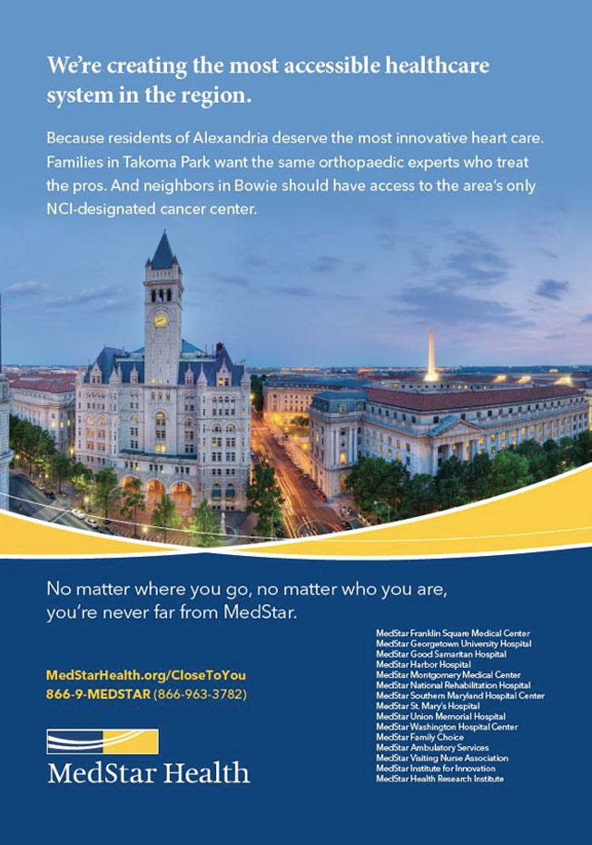
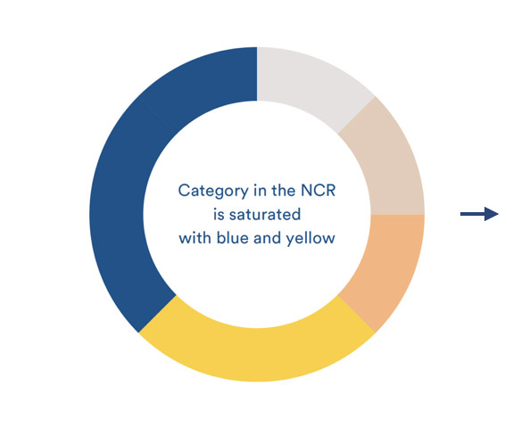
Blues, yellows and grays, along with traditional fonts
are used by every mayor competitor



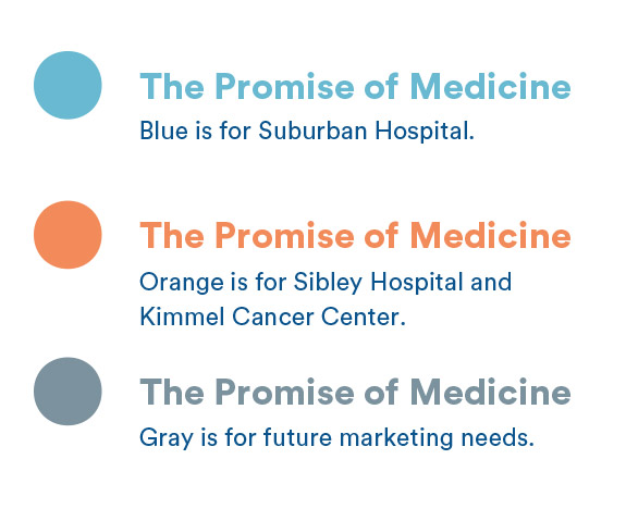
A refresh built on Hopkins’ own values: rigor and dedication, expressed through a cleaner, more modern look. The Promise of Medicine became the internal shorthand for that shift, same standards, told with more warmth.

Typography
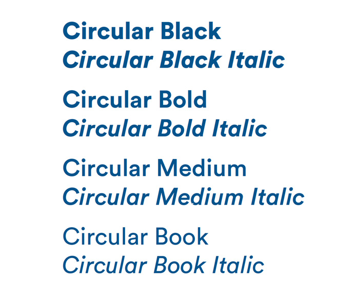
Typography had to be modern and readable in digital displays, yet warm and approachable.
Circular replaced Hopkins’ dated system: geometric, warm, and legible on screens, a natural complement to the Garamond already in their logo.