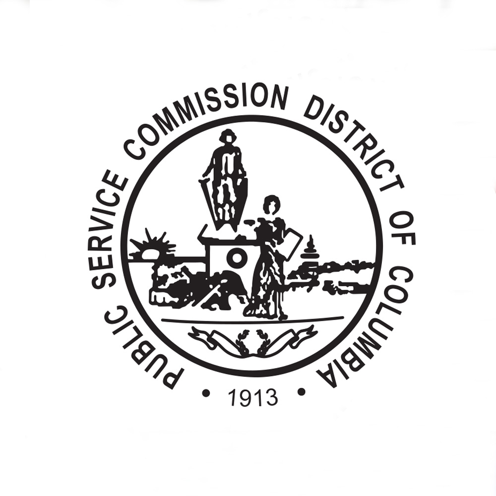
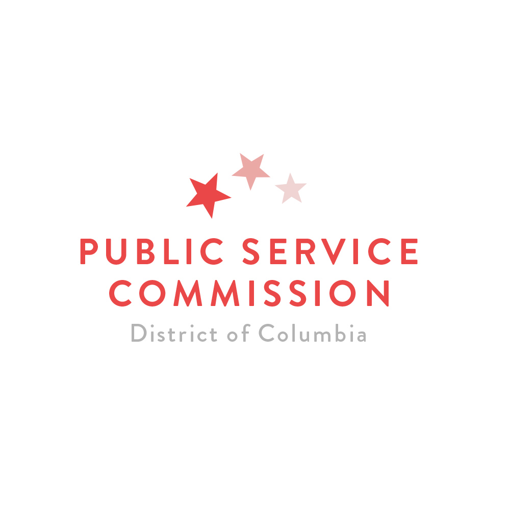
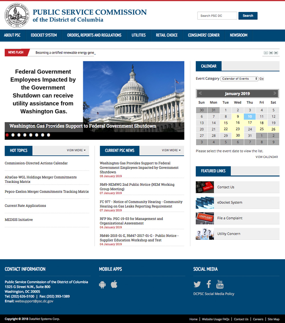
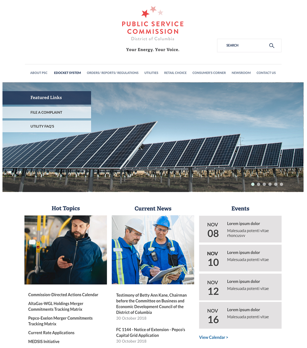
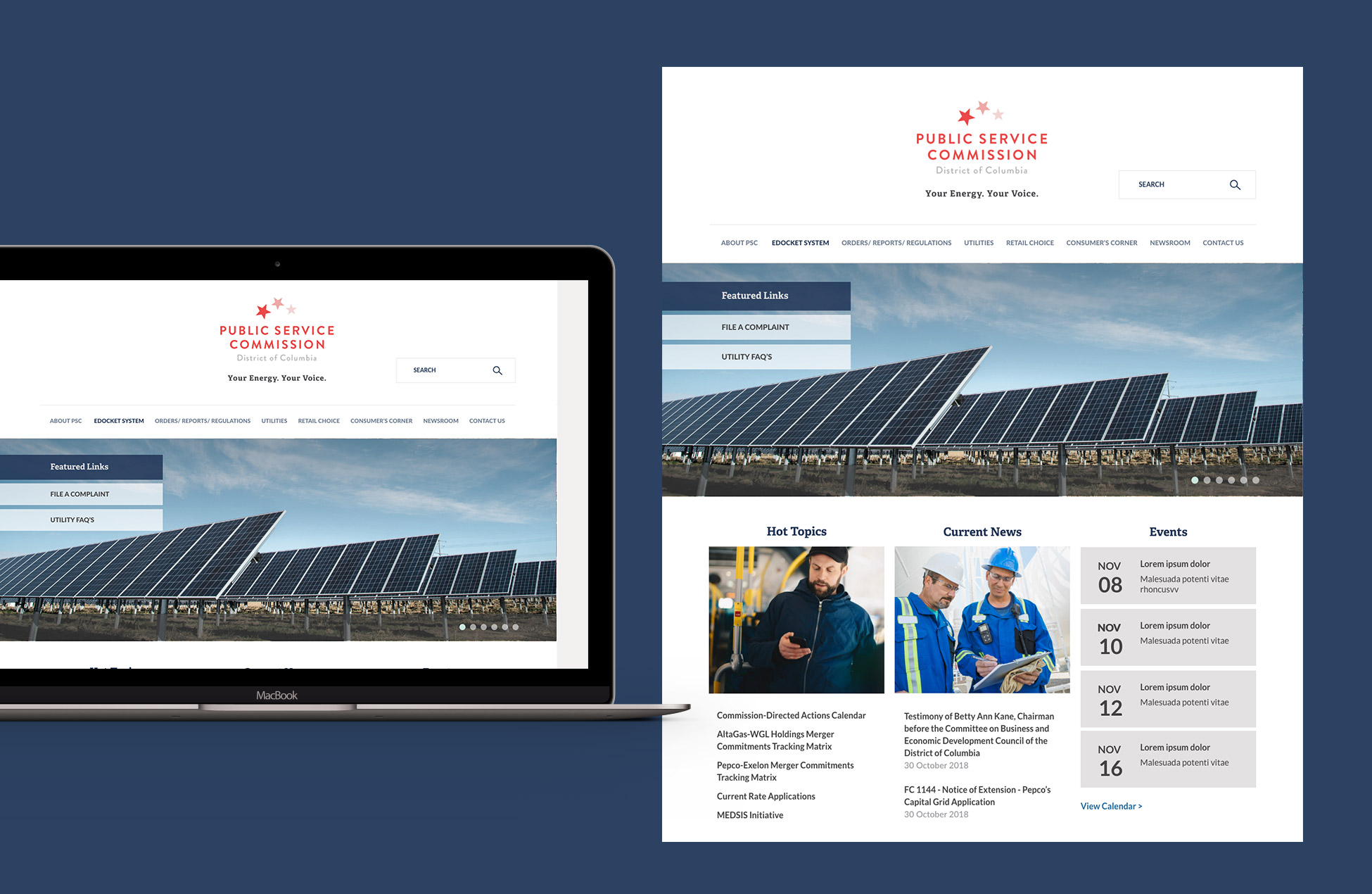
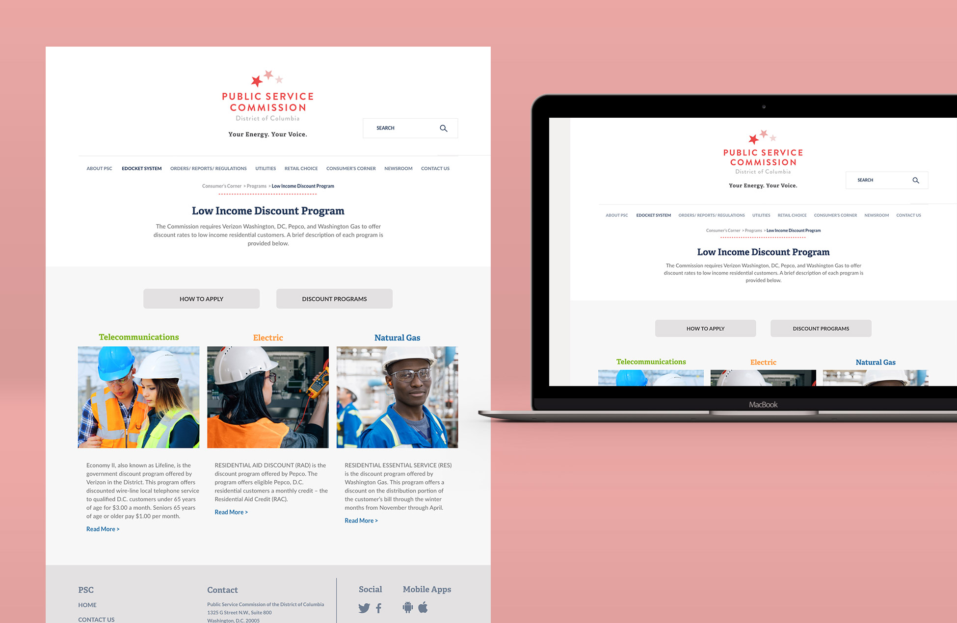
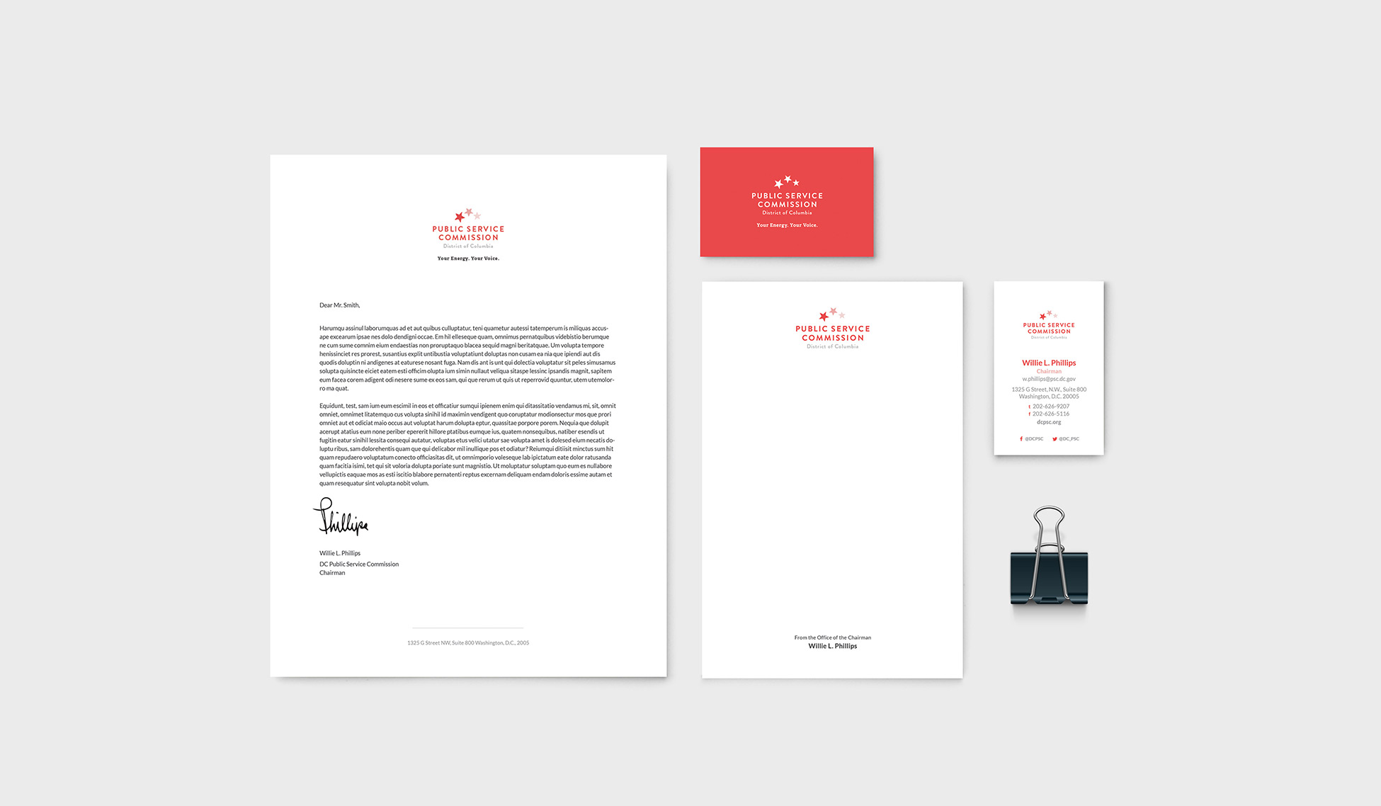
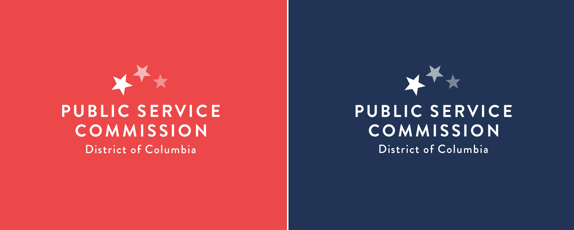
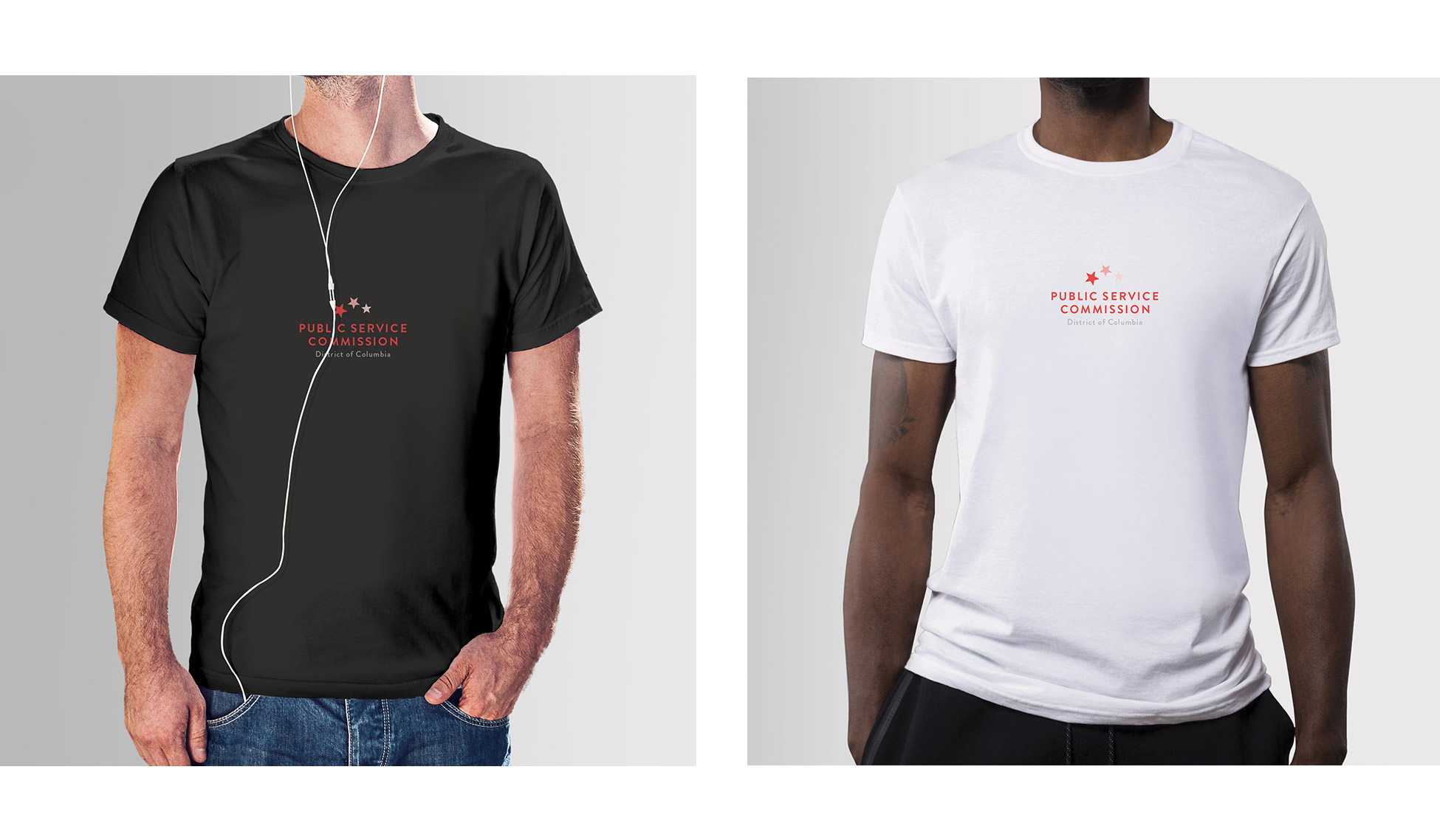
Challenge

Create a new logo and brand identity for the District of Columbia Public Service Commission, a government agency that handles utility logistics on behalf of DC for telecommunications, electricity, and gas. 

We had to make sure to that DCPSC stood out from other utility focused agencies, so residents would not confuse them. The new look needed to reflect their purpose, be future-forward, and recognizable to get citizens excited for the local changes to come that will be spearheaded by DCPSC.

Solution

We came up with a clean, modern logo that is easy to read and carries the local spirit, inspired by the DC flag. 3 stars match the 3 services offered by DCPSC, and the bars are replaced by the name of the agency. 

To keep the D.C. prominence, we used variations of red in the logo. For the services they coordinate, we chose clean, bright imagery for use on social media and their website to bring a literal sense of energy to their online presence. 

Project

DCPSC Branding

Client

Public Service Commission of the District of Columbia

What We Did

Brand Design, Graphic Design, Art Direction, Copywriting, Social Media Campaign

The DCPSC Logo

From a traditional seal...

DCPSC's original logo is a traditional, old fashioned seal. It's a nod to D.C.'s past and this type of mark is commonly used by other similar governmental agencies. Since DCPSC wanted to change the look and perception of their agency, it made sense to start by updating their logo to something more current.

To a modern word mark

With three red stars and lines of copy, the new logo playfully mimics D.C's flag. "Three" also hints at the three utilities offered by DCPSC: Electric, Natural Gas, and Telecommunications.

Web Presence

The old website

The old website was text heavy, making it overwhelming for the user. Our goal was lay out the content in a way that felt open and approachable, remove unnecessary content if possible, and give the site an updated look to go along with the new branding.

The new look

Adding more white space to the new site breaks up information, making it easier to navigate. Changing the full calendar to an upcoming events list on the homepage provides users with only the information that they need. Presentation of content can really improve user experience on a website.

Brand Development

Social Guidelines

Sample social media posts were created. These were broken up into three categories to show versatility: Quotes, Statistics, and Community.

Fun Facts

Donuts consumed
37
Stars rotated
3
Pixels moved
783

Leave a Reply